
By Charles Brown, January 6, 2020
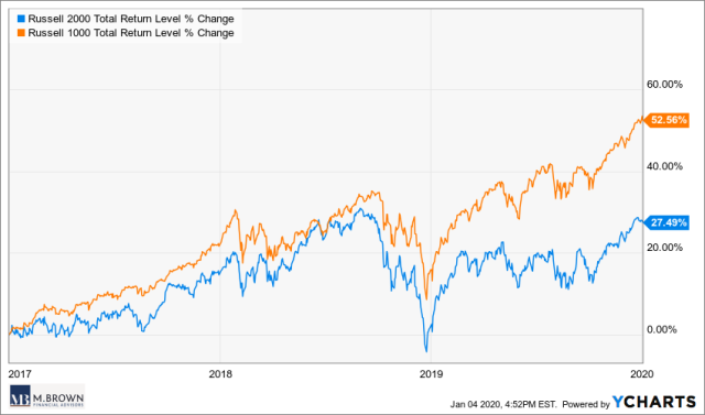
As the 2020 investing year gets going, I thought I would post a few of the charts* that I think are important for investors this year. This first chart is of the performance of the Russell 2000 versus the Russell 1000 since the start of 2017.
The Russell 1000 consists of the largest 1000 companies on US exchanges by market capitalization. The Russell 2000 is an index that owns the next 2000 largest stocks by market capitalization. Therefore, The Russell 1000 is mostly large capitalization companies (Apple, Exxon, etc..) and the Russell 2000 consists of smaller companies.
If you own a well-diversified portfolio, then you most likely own small capitalization stocks. As you can see, smaller companies in the US have not kept pace with their large cap brethren (Russell 1000) over the last three years with the gap getting even wider this year. Will 2020 be the year that smaller companies finally beat large companies in terms of stock performance? We shall see.
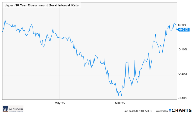
This second chart is a little out there, but stay with me here – it is a chart of the Japanese 10 year government bond yield. In 2019 I wrote a post about the increasing amount of negative yielding bonds globally – you can read it here. With negative yielding debt you pay the issuer to hold their debt, not the other way around.
This chart is showing us that although Japanese 10 year bonds had a negative yield for most of 2019, that yield briefly went positive late in 2019. Since bond prices move inversely to yields, that means the price of these bonds are decreasing which means losses for anyone who bought them when they had negative yields.
Who would buy a negative yielding bond? For starters, any global bond index fund or an indexed target date retirement fund that you may own in your 401k. If the yield on these bonds continues to rise (prices fall), then active bond fund managers who have shunned negative yielding bonds could have a great 2020 compared to their benchmarks and indexed bond funds.
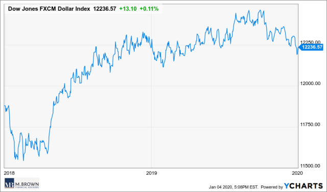
The third chart is of the US Dollar when compared to a basket of foreign currencies** since January 2018. When you purchase international stocks or emerging market stocks, you sell your dollars and buy the stock in the local currency. That means that if the local currency depreciates versus the US dollar then those currency movements will hurt your returns in that security.
For the last few years international stocks and emerging market stocks have trailed US stocks partly because of the rising value of the US dollar. If the US dollar can reverse course in 2020, then international and emerging market stocks could finally have their day in the sun.
*Charts are from Ycharts
**Euro, Yen, Pound, Aussie Dollar
***The above article is informational in nature only and is not a recommendation to buy or sell securities. All information is gathered from sources believed to be reliable, but neither Charles Brown nor Ausdal Financial Partners, Inc guarantees the accuracy of the information. All investments carry a degree of risk. Individuals should consult with their tax and investment professionals before making changes to their investment portfolios.
****Securities and Investment Advisory services offered through Ausdal Financial Partners, Inc, 5187 Utica Ridge Road, Davenport, IA 52807 (563)326-2064. Member: FINRA/SIPC. M.Brown and Associates / M. Brown Financial Advisors and Ausdal Financial Partners are independently owned and operated.